Template Pack Walkthrough – Easy Level
Archived file. Good only up to BP 1.6.5 version
BP TEMPLATE PACK 1.0.2 with MOTION THEME 1.0.7 on WORDPRESS 3.0.1 and BUDDYPRESS 1.2.5.2
After moving the BP Template Pack component folders into your active WordPress theme in Step 1 and getting a success message in Step 2 regarding the transfer, you will proceed to Step 3 where you’ll be asked to check if the HTML structure is aligned. To illustrate this step, we will be using the 2-column Motion Theme which is available for download at the WordPress Themes repository.

Motion Theme
Going Through the BP Template Pack Compatibility Process
Activating the BP Template Pack plugin and going through the first two steps of the process do not affect the layout of the regular pages as seen below except to add the BP Admin Bar positioned above the body of the theme.

Going to the site’s activity page (http://yoursite.com/activity/) however, you’ll find that some elements of the BuddyPress components need to be tweaked.

We need to compare the template structures of the Motion Theme with the BP templates which have been transferred to the folder of your active theme and transpose the HTML structure of the Motion Theme onto the 13 Template Pack files. (Note: 16 template files as of BP 1.5)
BP templates use this HTML structure by default:
[HEADER]
<div id="container">
	<div id="content">
		[PAGE CONTENT]
	</div>
</div>
<div id="sidebar">
	[SIDEBAR CONTENT]
</div>
[FOOTER]
Full Width and/or 2-Column Layout for BP Components
Per instructions in Step 3, you should look at the page.php or the index.php file of your active WP theme and copy the HTML structure there onto the 13 BP template files (Note: 16 template files as of BP 1.5).
The Motion theme has a full width structure (no sidebar) instead of a 2-column layout in its page.php and a 2-column layout in its index.php. We’ll be covering both layouts.
A. Full Width Layout
This is the HTML structure of Motion Theme’s page.php
[HEADER]
<div id="main">
	<div id="content" class="full">
		[PAGE CONTENT]
	</div><!-- /content -->
</div><!-- /main -->
[FOOTER]
If you choose to have full width pages for your BuddyPress components, starting with the activity/index.php file which is now in your Motion Theme’s folder you will need to replace
<div id="container">
	<div id="content">
with
<div id="main">
	<div id="content" class="full">
Then at the bottom part of activity/index.php, replace
	</div>
	<div id="sidebar">
		[SIDEBAR CONTENT]
	</div>
</div>
with
	</div><!-- /content -->
</div><!-- /main -->
After which, you then make the same revisions in the remaining template files as indicated in the instructions in Step 3 of the process.
Note: list below has been updated to show the 16 template files which need to be revised.
- /activity/index.php – DONE above
- /blogs/create.php
- /blogs/index.php
- /forums/index.php
- /groups/index.php
- /groups/create.php
- /groups/single/home.php
- /groups/single/plugins.php
- /members/index.php
- /members/single/home.php
- /members/single/plugins.php
- /members/single/settings/delete-account.php
- /members/single/settings/general.php
- /members/single/settings/notifications.php
- /registration/activate.php
- /registration/register.php
B. 2-Column Layout
If you prefer to have a 2-column layout for your BP component pages, open up Motion theme’s index.php file and you’ll see the HTML structure like so:
[HEADER]
<div id="main">
	<div id="content">
		[PAGE CONTENT]
	</div>
	<div id="sidebar">
		[SIDEBAR CONTENT]
	</div>
</div>
[FOOTER]
The template file structure of Motion Theme’s 2-column layout is the same as the default BP Template Pack’s files’. You only need to modify the name of the container div from id=”container” to id=”main”. Replace
<div id="container">
with
<div id="main">
starting with the activity/index.php then apply revision to the remaining BP template files which need to be revised per list.
An Alternative Way to Implement the 2-column Layout
Fortunately, the Motion theme does not have #container div in any of its template files – checked in style.css and double-checked in header.php. So instead of going through the tedious process of changing the container div from #container to #main in the 13 BP template files (Note: 16 template files as of BP 1.5), it would be much easier to tweak the layout in all aforementioned files by making one change in Motion theme’s style.css.
Add the #container div selector in Motion theme’s style.css file. Change this
#main {
	padding: 30px 0 20px 0;
}
to this
#main, #container {
	padding: 30px 0 20px 0;
}
That was easy. Using this method, you won’t need to make revisions to 13 template files (Note: 16 template files in BP 1.5) each time the BP Template Pack plugin is updated.
Using Different Layouts for Different Components
Now that you know the HTML structures of Motion theme templates for full width and 2-columns layouts, you have the option to apply full widths to certain BP components and 2-columns for the others. The images below show a member’s activity page with a 2-column format and with a full width format (click on images to enlarge). Your choice.

 After you implement the layout/s you preferred for the BP Components in the BP template files, you’re ready to go to the final steps of the process.
Final Steps
A. Add BuddyPress Tag to Motion Theme’s style.css
/*
Theme Name: Motion
...
...
Tags: buddypress, black, blue, green, dark, two-columns, sticky-post, threaded-comments, fixed-width, right-sidebar
...
...
*/
B. Add BP Component Navigation Links
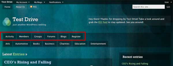
You can add the navigation links for the BuddyPress Components you have enabled for your site in at least three different areas in Motion Theme’s header.php file.
1. Add BP navigation links to div#topmenu in header.php
	<div id="topmenu">
		<ul>
			<?php if ( !motion_hide_homelink() ) : ?><li class="page_item<?php echo ( is_home() || is_front_page() ? ' current_page_item' : '' ); ?>"><a href="<?php echo get_option( 'home' ); ?>/">Home</a></li><?php endif; ?>
			<?php wp_list_pages( 'depth=1&title_li=0&sort_column=menu_order' ); ?>
			<li><a href="http://yoursite.com/activity/">Activity</a></li>
			<li><a href="http://yoursite.com/members/">Members</a></li>
			<li><a href="http://yoursite.com/groups/">Groups</a></li>
			<li><a href="http://yoursite.com/forums/">Forums</a></li>
			<li><a href="http://yoursite.com/blogs/">Blogs</a></li>
			<li><a href="http://yoursite.com/register/">Register</a></li>
			<li><a class="rss" href="<?php bloginfo( 'rss2_url' ); ?>">RSS</a></li>
		</ul>
	</div>
The result:

2. Replace Category Links in div#catnav
<div id="catnav">
	<ul id="nav">
		<li><a href="http://yoursite.com/activity/">Activity</a></li>
		<li><a href="http://yoursite.com/members/">Members</a></li>
		<li><a href="http://yoursite.com/groups/">Groups</a></li>
		<li><a href="http://yoursite.com/forums/">Forums</a></li>
		<li><a href="http://yoursite.com/blogs/">Blogs</a></li>
		<li><a href="http://yoursite.com/register/">Register</a></li>
	</ul>
</div><!-- /catnav -->
The result:

3. Add a New div Above div#catnav
<div id="newbplinks">
	<ul id="newbp">
		<li><a href="http://yoursite.com/activity/">Activity</a></li>
		<li><a href="http://yoursite.com/members/">Members</a></li>
		<li><a href="http://yoursite.com/groups/">Groups</a></li>
		<li><a href="http://yoursite.com/forums/">Forums</a></li>
		<li><a href="http://yoursite.com/blogs/">Blogs</a></li>
		<li><a href="http://yoursite.com/register/">Register</a></li>
	</ul>
</div><!-- /newbplinks -->
And use the styling of #catnav in this new div#newbplinks
/************************************************
* New BP Component-specific Links Div  *
************************************************/
#newbplinks {
	overflow: hidden;
	width: 980px;
	background: url(images/blacktrans.png);
}

#newbp li {
	float: left;
	background: url(images/blacktrans.png);
	line-height: 2em;
	margin: 5px 0 5px 5px;
}
#newbp li:hover {
	background: url(images/blacktrans2.png);
}
#newbp li a {
	display: block;
	margin: 0;
	font-size: 0.8em;
	color: #fff;
	padding: 0 13px;
}
#newbp li a:hover {
	color: #afdaff;
	text-decoration: none;
	display: block;
}
#newbp li ul {
	position: absolute;
	width: 180px;
	left: -999em;
	padding-top: 5px;
	margin: 0;
}
#newbp li:hover ul,#newbp li.sfhover ul {
	left: auto;
}
#newbp li li {
	padding: 0;
	margin: 0;
	width: 180px;
	line-height: 1.5em;
}
#newbp li li a {
	color: #fff;
	margin: 0;
	padding: 7px 13px;
	background: url(images/blacktrans3.png);
}
#newbp li li ul li {
	margin-left: 13px;
}
#newbp li li a:hover {
	color: #afdaff;
}
#newbp li:hover,#newbp li.sfhover {
	position:static; /* prevents IE7 drop-down menu bug where focus on a page element prevents nested menus from disappearing */
}
The result:
C. Style Elements of BP Component
At this stage, we need to make a few more tweaks to some elements so that the integration of BP components can be completed.
1. Disable BP Template Pack CSS
In the final steps check “Disable BP Template Pack CSS” and click on the “Save Settings” link. Copy bp.css included in Template Pack and paste at the bottom of Motion Theme’s style.css file.
Change the path of adminbar.css you copied and move it along with the line above it up to right under the stylesheet header.
From
@import url( ../buddypress/bp-themes/bp-default/_inc/css/adminbar.css );
to
@import url( ../../plugins/buddypress/bp-themes/bp-default/_inc/css/adminbar.css );
Move lines to under style.css header
/*
Theme Name: Motion
...
...
Tags: buddypress, black, blue, green, dark, two-columns, sticky-post, threaded-comments, fixed-width, right-sidebar
...
...
*/

/* Load the default admin bar styles */
@import url( ../../plugins/buddypress/bp-themes/bp-default/_inc/css/adminbar.css );
2. Component-specific Styling Tweaks
While some styles from bp.css cover the general layout of the elements within the different components, some additional tweaks are recommended. Some examples:
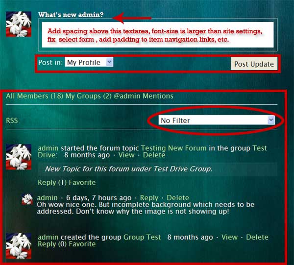


For this particular theme, you can add this at the bottom of your theme’s style.css to correct font-sizes, alignments, etc.
/************************************************
* Theme-Specific CSS Tweaks *
************************************************/

div.item-list-tabs,
ul.activity-list,
ul.item-list,
div#whats-new-options,
form.dir-form div.dir-search,
div.pag-count,
div.info,
form#forum-topic-form label,
form#forum-topic-form select,
form#forum-topic-form div.submit,
form.standard-form textarea,
div#item-header div#item-header-content,
div#topic-meta a,
form.standard-form input[type="text"] {
	font-size: 0.8em;
	line-height:1.5em;
}

div#item-header-content h2 a {
	font-size: 1.5em;
	line-height: 1em;
}

form.dir-form div.dir-search {
	margin-top: -20px;
	width: auto;
}

form#forum-topic-form {
	margin-top: 20px;
}

form.standard-form textarea,
form.standard-form input[type="text"] {
	width: 100%;
}

div#item-header div#item-actions {
	float:right;
	margin:0 0 15px 15px;
	text-align:right;
	width:20%;
}

div#item-header div#item-actions h3 {
	font-size: 0.8em;
	line-height: 1em;
	margin:0 0 5px;
}

div#topic-meta h3,
div#post-topic-reply h4 {
	padding: 15px 0px;
}

div.poster-meta img.avatar {
	float: left;
	margin: 0px 7px 7px 0px;
}

div.item-list-tabs ul li {
	margin-right: 0px;
}

div.item-list-tabs ul li a {
	display: block;
	padding: 5px 10px 3px 0px;;
	text-decoration: none;
}

table.forum {
	font-size: 0.75em;
	line-height: 1.4em;
	width: 100%;
}

table.forum a img.avatar,
table.forum div.poster-name {
	float: left;
	margin-right: 5px;
}

form#whats-new-form #whats-new-textarea {
	margin-top: 10px;
}

div.dir-search label {
	display: inline;
}

ul#groups-list li,
ul#members-list li,
ul#blogs-list li,
ul#topic-post-list li {
	margin-bottom: 15px;
}
Adjust above styling to taste.